Sactown: Year One. Making a Magazine From Scratch

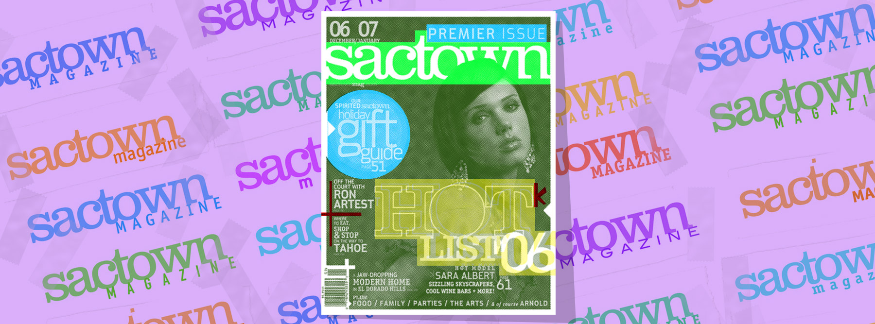
10 Years. I was there for nearly every day but it still seems kind of insane that it’s been over a decade since we launched Sactown. Perhaps it’s because its a bimonthly, so the relatively smaller number of issues (we’re currently in the mid-60s) makes the timeline feel more condensed. Whatever it is, it’s been a long, strange, trip. And other overused cliches as well.
In November 2005, I was miserable working for a now-defunct Sacramento glossy that I will attempt to be charitable by not mentioning by name. My girlfriend at the time knew this and kept trying to get me to put myself out there and actively find something better. That something better came in the form of a Craigslist ad she found about a Sacramento magazine startup that was looking for an art director. There was only one problem: the ad was from the Bay Area Craigslist. (To cast a wide net, they had placed ads both in Sacramento and San Francisco.)

Surely they were looking for a superstar. Someone with a name and an armload of awards under it. So naturally I demurred to save myself the embarrassment. She pressed me on the issue so I responded to the ad, mostly just to get her to stop bothering me about it. Fortunately, they were interested in meeting with me.

It was quite a process. I met with the founders Rob Turner and Elyssa Lee several times in their home and chopped up our different philosophies of what could make a new city mag in Sac work. We agreed that the city was coming into its own culturally (a prediction that has since proved itself accurate) and it needed a book that reflected that. A modern guide to a modern Sacramento. And thus, Sactown was born.

But first, I would have to jump through a few hoops. In spite of having built up a pretty sturdy showbook of publication work and redesigns by that point, they would still need to run me through a few spec tests to see what I could do with content a bit more specific to the model they had in mind. For the first time ever, I am going to show these publicly in spite of them being very overdesigned as they were the act of a desperate lad eager to show off every trick and style he had in the quiver. These arent great, but they give you an idea of what we were up to a year before the first issue hit the streets. You’ve been warned…

early design tests for Sactown magazineNovember 2005 design tests for the job of art directing Sactown magazine.

Ouch. Very 2005 and a bit all over the place. Kinda bubbling over with too many ideas but in the end I guess they were able to see through that to the potential in the bones of the work. Of course, none of these ideas would really end up surviving into the first issue, but it was enough to show them that we were all pointed more or less in the same direction. Over the Christmas holiday they made me an offer and once the new year started, so would we.

We need a logo

In their initial work feeling out the market, the founders commissioned Fuel Creative Group to put together some spec designs to show around and prime the ground for the arrival of a new mag, and the midtown-based firm created a logo based on Clarendon Medium, with a bit of flourish at the tail end on the “n,” using an upside-down “u” to produce a unique serif version of the last letter.

Fuel Creative's original logo concept for Sactown magazineFuel Creative’s original logo concept for Sactown magazine. 2005.

I liked the initial logo, but I wanted to add more twists to it, so I dropped it into Illustrator, beefed up the silhouette with a stroke a couple tenths of a point thick, brought the characters closer together giving them a more graphic ligature, and locked the forms together with a cutout brace in the middle.

several variants in the running for the original sactown logo

Several variants which were in the running to be the original Sactown logo.
The initial logo for Sactown magazine at launch in 2006
The initial logo for Sactown magazine at launch in 2006.

I also added a second flavor to the mix in the form of ITC’s Conduit font, which would prove to be indispensable those first couple years. A modern, clean, sturdy font that played its role quietly while also hinting at sophistication without commanding too much attention. For the basic color palette I chose a (very-mid-aughts) smart maroon and burnt red/brown to give the logo an earthy-yet-urban feel. We had our flag and colors to fly on our initial promo materials.

Stationery and Media Kits

A vitally important part of introducing ourselves to the world was our media kit. Since there was no magazine yet, the kit needed to be much more than a folder with our logo, a letter from the publisher, and a rate sheet. This was a shot across the bow of our market and we wanted it to be heard as clearly as possible. Thus, I went full on arts-and-crafts with it, creating an elaborate full-color package of tabbed cards (that I cut by hand) all designed to work together as a piece visually. To be honest, they were a bit of a nightmare on a practical level to design, print, assemble, etc but they looked great and were very impressive. Lots of relationships Sactown has to this day began with that kit.


The very first Sactown media kit: Spring 2006The very first Sactown media kit: Spring 2006

Mock-Ups

So now we need to show people the magazine that does not yet exist. How to sell something that isn’t yet a thing? We need to both generate excitement and also be true to what the book ultimately will be. We’d start with some covers. Most of what would happen inside the book visually would follow the lead of the cover anyway. At this point we were still nailing down exactly what departments would feature in each issue, so tackling the cover design would not only help us lay down some basic style rules but also help to inspire what the inside would ultimately look and feel like. Some of these rules would survive intact and some in spirit in the final published book but the important thing was they set the right tone. With this relatively small step Sactown became real in a way it hadn’t before that. For us as well as everyone awaiting its arrival. We even had fun with it, inventing an “it girl” ingenue in the form of mock-up cover star (and now long-running inside joke) Glory Adams.

Initial mock cover designs for Sactown magazine. 2006Glory Adams and Jackie Greene: one we totally made-up and the other a future Sactown cover star.

We tried a lot of crazy things with those mockups: the transparent gradient under cover footer lines, the obnoxiously large issue date, arrows and plus signs all over, that bar code that might have worked(?) but two crucial elements to our early identity are there and they would survive the initial design process well into the first few years of the magazine: the white half-inch border framing the cover photo to give the magazine overall the feel of an art or coffee table book, and the issue number tab running vertically up the left hand side. I fought for that tab and the reasoning behind it: by making serialization of each issue an overt part of the design we are both suggesting that this is something to be collected and that it is more important than the usual glossy mag you toss out at the end of the month. This was something maybe you’d want to keep. In fact, we not only wanted to position ourself apart from other glossies but we in fact would not be a glossy altogether.

From the start, we all agreed that matte was where we wanted to be. A smart matte finish, satin even. Heavy paper with a substantial tactile weight and feel. No small detail, we would spend much of June and July handling blank bound volumes with our eyes closed to feel-test different paper stocks, weights, finishes, and UV coatings against each other. We wanted a magazine that could take heavy ink flood without fluting, that could reproduce photos beautifully, and that would feel important in your hands. Part of the reader’s experience would be tactile and we wanted to be sure not to neglect that.

Establishing Type

We now had some traction. We had a visual spirit to work with. Next, we would need to assemble our players. Im a fan of classic type. What I saw Sactown‘s voice being was a kind of classic modern. I wanted to create a modern look that pushed some edges here and there, but that felt analog in its execution. A 2006 look that could have been created with 1966 tools. I would ground my color palette in earthy browns and reds and slates and cobalts. The color palette for that first year was never so much regimented as it was simply understood. We knew from inception that we were gong to lean heavily on gorgeous widescreen photography. The design would need to buttress where possible, supplement where able, and augment when needed. I aimed for a look that could make great photography shine brighter and (god forbid we ever got any) offer bad photography a crutch. We were extremely fortunate to never have to deal with the latter. In fact we’ve suffered from—if anything—an embarrassment of photographic riches since day one. Our shooters would become as much part of the DNA of Sactown‘s look as any font or masthead. And our type stable at launch was no slouch. We’d lean primarily on three typefaces: Emigre‘s Eidetic Neo, a semi-severe bit of serif that blurs the lines between body and display in a way that I think worked well for the voice we needed to project coming out of the gate. MetroSac was a custom face I had Frankenstein’d together in Fontographer when I realized I was never going to find a sans as cool as what Details was using at the time, and to square things off, a reliable condensed that I had relied on as a go-to for years: Din Schrift, a sturdy utility font strong enough to quietly take a backseat and play support to its two siblings. We had our type stable.

The initial typestack Sactown launched with in 2006.

Adding texture and detail

Sactown needed to be a different kind of city mag. I wanted you to know before you read a single word that you were dealing with a different personality with a different voice. I eschewed the mid-aughts’ rediscovery of Swiss minimalism in favor of a kind of maximalism on the page. I took some cues from web-style information architecture and melded them with the limitations of print. Side-strips of simple navigation appeared under your thumb on every editorial page you went to. I color coded departments with simple tabs to give readers their bearings and a sense of place even if they didn’t know they were. The templates were constructed from spanning headlines in colors and sizes emphasizing different facets of the story, balanced against cantilevered deks, sleek hairlines, subway-map arrows leading you through sections, and unorthodox elements like paper textures in the margins. Rounded story lead-in arrows would slide into place to guide the eye in. Every page needed to feel alive and its presentation an active companion to the text it presented. I wanted something that felt a bit more interactive than just text and image delivery, and it felt in 2006 like readers were ready for that as well. The result of this was a book that didn’t really look like anything else out there at the time.

An early spread for a story on renowned architect Zaha Hadid.

Issue One: Premier not Premiere

The first issue of any magazine is always simultaneously the easiest and the hardest. Easiest because you’ve essentially had your entire life to decide what’s going into it and hardest because everything you’re doing you’re doing for the first time, reliant on methods, infrastructure, and protocols that are all getting tested for the very first time. The run to the finish line for that first issue (dubbed our “Premier” issue, in a stroke of grammatical correctness that baffled everyone that had been using the secondary spelling of the word as an adjective for years) was as hard as anything we’ve had to tackle since. We quite literally worked night and day (and the next night again) on Issue #1. We went to a sporting goods store and bought inflatable mats to keep behind our desks so we could switch off and do 90 minute slingshot naps to keep us rolling through it all. I was emptying my office trashcan twice as often as it filled up endlessly with spent energy drink cans. It was such a content-rich issue—and we were such a skeleton crew— that we ended up going to press a few weeks later than was ideal but in the end we made it up the hill. Issue One of Sactown came out around Thanksgiving 2006, fully 11 months after I came aboard. It made a huge splash and set a very high bar that we’ve only improved on since.

Sactown magazine's premier issue 2006
The cover of Sactown‘s premier issue. November 2006.

Our Band Could Be Your Typography Lesson

Our Band Could Be Your Typography Lesson

Note: this blog post originally ran at my other site in February of 2017

13, Broke, Curious, Bored

The moment is indelibly burnt into my memory.

Every Sunday morning, I’d pick through the day’s edition of the Omaha World Herald, digging through sooty inserts and box store circulars to more or less fixate on the comics, entertainment section, the ads.

What I ultimately was after were the record store flyouts: rows and rows of colorful thumbnails of exciting-looking records I had no money to buy. If I was lucky my uncle would pick up a copy of something I wanted to hear and I’d be able to make a dub off his. At the time, I didn’t really live within walking distance of a record store and I had two holidays a year where I might get gifted music and those were spread out perfectly 6 months apart. So for me, the sunday Musicland ad was my version of window shopping.

This must have been autumn of 1987 because there it was: R.E.M.’s Document, their top 10 breakthrough album after years spent toiling in the underground. The cover design was sharp and arty and completely oblique. It was an intriguing image even at 1.5 inches square: no band photo, fractured black and white abstract image, and there in the corner was it’s coup d’grace: a stamped icon that read “R.E.M. No. 5.” They had actually taken the bold step of numbering the album as one in a sequence. I cant describe how brilliant that seemed the first time I saw it. When you’re that young, every even mildly innovative idea you come across seems like a lightning bolt. Everything is new to you so when something sets itself in stark relief to other things like it its as if you discovered the genius of it all on your own. After all, everything is effetely happening for the very first time. To me the cover was a bold statement that managed to straddle both art and pop culture and thus it absolutely imprinted on me. But alas, I had no money so it would be another 18 months before I’d even hear the record for the first time.

s-l1600Not the Musicland ad but a trade ad from the same period I swiped from eBay.

I was fortunate to have an aunt and uncle only a couple years older than me and that opened up my world to live music. Officially my first concert was The Monkees’ 20th Anniversary Tour at the Douglas County Fair in August 1986 and I almost feel like this should count since in spite of it being a county fair it occurred during the height of MTV-stoked Monkeemania 2.0 and it was an endless sea of people as a result.

If Im being stricter about it, my first real concert experience was INXS on the Kick tour in June 1988 (opener: Steel Pulse). Having little-to-no allowance and few concert options in Omaha (let alone ones my parents would agree to let me attend, even with my aunt and uncle as de facto chaperones) the idea of attending a concert, any concert at all became more than enough the point. I was hooked. I could probably have enjoyed any show you dropped me off at around that time, regardless of band or genre. I wanted to attend more shows. Badly.

Fast forward to the next spring. Bon Jovi was touring their New Jersey album and a stop in Omaha was slated. I gave my uncle the last $20 from my Christmas money and hoped for the best, reason being this was the pre-Ticketmaster era where you had to physically call record stores to find out which seats they had in stock from which rows and then hope you could drive over there before someone else beat you to them. I was hardly the world’s biggest Bon Jovi fan but that didn’t really matter. This was a Concert. And a big one at that. That’s what mattered.

A week or so later, my uncle calls me after school and says, “we’re thinking about doing R.E.M. instead. What do you think?”
I pretended to seriously deliberate on this for a moment long enough to make it seem like I was a wizened music snob before replying “sure, let’s do that.” I knew that I loved that cover and I knew that at my Jr. High dances “End of the World As We Know It” would blow the floor up into a rager in that crucial last half hour. And again, most importantly this was a concert. And it would also be a big one, if not quite as bombastic as what Bon Jovi had in mind. Little did I know how completely different my life would have been if we’d just settled on the Bon Jovi show instead.

March 10, 1989

R.E.M. Civic Auditorium Arena. Omaha, Nebraska. Literally everything changes. Forever.
I’m certain that everybody has that one show that sets the metrics for what every show they see forever after can and should be, and I was incredibly fortunate that this was mine. As an awkward, dorky kid with artistic leanings, I had an inkling that I wanted something more from music but for the most part the furthest I’d been to the fringes was mildly-left-of-the-dial mid-80s Top 40 like INXS, OMD, etc. My tastes hadn’t even developed to the point that I knew there was any room to expand on them. One night in March and all that changes. Right up front you knew that you were seeing another animal entirely. Rather than doing rote audience greetings, they used massive onstage projections to subvert those tropes, for instance minimal white text on black declaring “It’s great to be in (insert the name of your town here).” It was at once showbiz and abstract. Nowdays this isn’t such a strange thing as LED walls and computer graphics allow even the smallest acts to turn their shows into multi-media experiences, but in 1989 this was both a callback to Fillmore West-style psychedelia and a step forward into a more alternative conception of what the live experience could be. Great, blown out abstracted reels would flood the stage with light, unplanned intersections of music and image nudging and colliding sparking happy accidental moments. It was as random as a Pink Floyd show was choreographed and that made all the difference.Where the performance had a whirling careening quality (flush I suppose with the confidence of having already stacked 6 classic albums 8 years into your career) it was also the most structured thing the band had done to date. I’d hear lifers around this time complain (as they always do) that the band had lost the magically oblique sense that “anything could happen” that was a product of the mystique they’d nurtured during their IRS years and the natural result of a band becoming too big to truly belong to anyone on a personal level anymore.

9

While their albums up to that time usually had established visual motifs that would cascade through their singles sleeves, merch, etc, Green was the first time there seemed to be a strict and established design system undergirding all the album’s materials. Maybe moving to Warners gave them greater resources in the packaging department, greater control, maybe they finally had a record that they felt was a cohesive enough statement to bring that uniformity of design into the fold, maybe Stipe was just really enamored of Robert Wiebking’s Venus SB Bold Extended typeface and was keen to work it in everywhere he could. It didn’t really matter. I was at the age where I was starting to understand the album as Complete Artistic Statement and seeing this carried through in their aesthetic was absolutely crucial to that end.

VenusSBBoldExtendedVenus SB Extended. The first typeface I ever learned and for a while my conception of the platonic ideal typeface. I learned to draw every character of this face and know it like the back of my hand as a result.

rem-greenR.E.M.’s 1989 album Green and it’s singles. Note how all but the final single “Pop Song ’89″adhere to a strict typographic style.


Drawing Alphabets, Illegitimate “R”s, and Remembering Things Wrong

So with the doors to a whole new world thrown open to me I now have so much to discover and I cant wait to get started. Unfortunately I still don’t have any money, necessary in 1989 if Im going to follow this obsession to see where it goes. I would walk a half hour from home to Homer’s Records in a ShopKo -anchored strip mall and spend hours staring at (sigh, dating myself pretty hard here) CD longboxes and absorbing as much detail as I could so that it would hold in my head long enough for me to get home and try to recreate elements of the designs with my pens and markers. This of course led to a lot of things bleeding together in my mind: the trestle from the back cover of Murmur melded with the Victorian buildings which bracketed the back cover tracklist of Fables, the scratchy odds-and-sods shaggy dog look of Dead Letter Office and the outsider art scrawl of the Reverend Howard Finster’s cover painting for Reckoning.

s-l1600Pre-release teaser art promoting Fables, showcasing its unique retro bent.

More than anything I was taken by their use of type. Every album had its own distinct fontstack ranging from strictly regimented (Lifes Rich Pageant’s signature use of Copperplate – one of the reasons I continue to cut that much-maligned typeface more slack than most) to kitchen sink (Fables’ “anything goes after midnight in the typesetters shop” stable of beautifully clashing vintage typefaces). Staring at these covers and poring over their secrets, injokes and coded hints (which IRS-era R.E.M. threaded through all their covers, even throwaway items like radio promo singles would have theme-reinforcing messages on their spines. See: “Finest Worksong”‘s “WANT” and “NEED” on opposite ends of its spine.) I spent a lot of time looking for underlying structure, of commonalities within the visuals.

One thing that stood out to me straightway was the lack of what I would come to call “illegitimate Rs”, or capital Rs where the leg on the right hand side was curved (illegitimate) rather than straight and sturdy (legitimate). With few exceptions (the R with the curved leg gracing their debut Murmur) R.E.M. steered clear of these lesser Rs. Something about this really stuck with me. It was probably nothing but to a kid under the spell of a deliberately mysterious band it had to mean something. It was more serious, artier, more structurally sound. It had to be, right? This seems like a small detail but for a 14-year-old budding typographic enthusiast, this was everything. It was easily the gateway drug into my typeface addiction and the yardstick by which I would measure other typefaces as I learned to identify them.

il_fullxfull.869350717_qey9

It’s also important to remember that this was 1989. Desktop publishing was in at best its infancy and I was a working class kid. If I wanted to experiment with type I had 2 options: I could scavenge the back walls of craft stores for whatever sets of LetraSet type decals they had in stock (and those were always slim pickins) and the photocopier at the public library in my neighborhood. This worked well enough for a while but I wanted more control. To get it I was going to have to learn to draw entire alphabets. I would use my record covers to divine what a full alphabet of a certain typeface might look like. So long as I had an uppercase R and an uppercase M, I could generally extrapolate from there what the rest of the font would look like. I spent hours sitting on my couch with a ruler and a mechanical pencil making single letters 6 inches tall in my sketchbook. I had to make them large so that shrinking them down (one of the few features the library’s photocopier offered) would forgive any imperfections in my line work. I killed countless brain cells inhaling fumes from endless black markers used to ink all the characters. It was tedious work but I was obsessed: I wanted access to the same tools print designers had even if I had to fake nearly all of my way there.

letrasetLetraSet rub-on decal type sets. Both a boon and a bane of the pre-desktop publishing era.

To make matters worse, I didn’t even have money to get the records I needed to base my fonts off of. I had to stare, study, mentally photograph, return home, and get to my sketchbook and begin work. And on top of that, if the record wasn’t in stock I would have to wait until the next time I saw my uncle and stare at the tiny thumbnail images of the band’s discography on the inner sleeve of the band’s IRS hits collection Eponymous. In a way this became more of a blessing than curse as those miniscule reproductions took things that were already mysterious and lacquered them with an extra layer of impossible mystique. I was both seeing things wrong and remembering them wrong and that caused my creativity to fill in the blanks to create something else entirely. It would be another year and a half before I would discover that the cover of Fables wasn’t an eroded abstract painting. For better or worse, my near-total lack of resources was fueling my shoestring design education.

The following summer, I received Tony Fletcher’s Remarks: The Story of R.E.M. as a birthday present. Aside from it being the band’s first published biography, spanning the Oconee Street church to the end of the 1989 world tour, it also featured a photo glossary of the band’s LPs and singles up to that point, and this time they were all in full color. I had more fuel for my inspiration. That summer I spent countless hours making custom cassette J-cards for mixtapes and album copies, spec tee shirt mockups and of course alternate cover art for albums and singles. I was using the band’s own art to create a kind of visual fanfiction. This was how I learned to follow stylistic cues and design to theme. And it was all happening on remaindered art room paper scraps and sketchbooks when I could afford them.

Needless to say, it was Green’s Venus that was my first foray into drawing my own type. It was at the time my favorite typeface (and one of the reasons I keep ITC’s Blair face close to my deck even today) and since there were long stretches of straight block line it was a good one to start with. After a while the curves weren’t even that much of a hassle, my hand control reaching post-chore Daniel-san heights of zen accuracy. Eventually I would loosen up a bit and drop the asceticism of the “legitimate” R’s, as even the band eventually would, kitting 1994’s Monster out in simple Helvetica Bold Oblique.

Other typefaces would follow, particularly once the Émigré-spurred custom font revolution of the early 90s kicked in. With bizarre type and grunge styles coming into vogue it became easier to hide the handmade abnormalities of my homemade type within the quirks of these faces.

Sadly, I never really kept copies of those early typefaces. You go off to art school, you move, you move again, that stuff gets scattered. But the lessons I learned over what must have been hundreds of hours hand-drawing type have stayed with me throughout my life and my career as a designer, and are almost-certainly the reason that every poster I design begins with color and type.

Boz, baby!

This Is the Day…This Is the Hour…This Is This

So I finally went and did it. After years and years of owning this URL (for a time your one-stop shop for a single picture of Boz Scaggs looking cool circa 1976) I decided to finally get off the proverbial pot (not an actual pot) and brand and populate this thing. To call it a “Herculean” effort would be an insult to that wonderfully awful Lou Ferrigno flick but that doesnt mean it wasn’t a whole hell of a lot of work. As this is my 20th year as a designer, there was a lot to sift through. two decades, several positions, lots of hats (actual hats as well), so many different skillsets…it was a lot to get my head around. In the end I figured to just dive in, get it all rolling, populate it with enough stuff to cover most of my bases and then just build as I go.
Some of you that only know me for my music-related art know that I’ve had that site (decabet) up and running since about 2010. It’s been the focus of most of my attention and my main online portfolio presence for 7+ years, but I needed a separate stead to show off everything else. Decabet.com isn’t going anywhere and I will continue to add new work to it as I make it, but its clientele arent going to be interested in seeing an app I illustrated for a solar panel company or a magazine layout about a chef so I set this one up as an overview of what it is that I do. Which is not to say that some posters won’t also find their way to these pages. In fact I’ve launched here with two notable recent posters in the mix. Some projects will live here, some there, some in both, and some will direct you to longer form case studies on the other site. I figure this is the easiest way possible to cordon off the distinct types of content without entirely neglecting either.
So, on these pages you will see some apps I’ve designed, some layouts, some posters, some identity and branding, some illustration. And in time you’ll see the full breadth of what it is I do and have been doing since I scored a part-part-part-time gig at a newsweekly back in 1997 and deliberately missed my one bus home every night as an excuse to lock myself in the office and teach myself how to use Photoshop, Illustrator, and (dating myself here) Quark and Pagemaker.
As this site becomes more thoroughly populated you’ll even see some things that reach back in time to those first few years I lived off energy drinks and pixelburn. For now, this is is.
Enjoy!