Coastal Country Jam
The industry comes roaring back
In winter 2019/20 I was working on art for several music festivals (nearly all festivals are planned several months in advance as they end up impacting many artists’ touring plans for the years they occur in. Of course then (motions around) things changed. Spring dates shifted optimistically to early summer, then late summer, then autumn before being ultimately shelved. A trend that would stick around for a year or two. Since Covid first hit in 2020 there have been multiple false starts and plans that never made it past the initial planning stages. 2023 felt like things were finally geting back to normal. That year I would do four music festivals just in the first four months of the year.
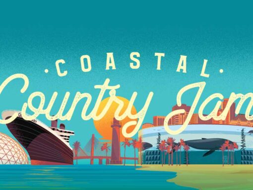
I was thrilled when Activated Events asked me to help them rebrand their long-running Coastal Country Jam festival, which would be returning in 2023 but in a very different location than its original stomping grounds in Huntington Beach. The festival was moving north. To Long Beach. And that change of venue was going to inform the artwork.
Avoiding the usual “country/western” tropes
Sure, this was a country music festival but it was also a California country music festival. On the beach no less. The look would need to avoid all the usual trappings associated with country music. No boots, for instance. And it should at least nod to the California model of country. A bit more Eagles than Charlie Daniels Band. I set to work on a few different brand marks to see about presenting this specific vibe. And as I often do, I would start with color. What could bridge the gap in vibe here? Sand, sea, earth tones and honky tonks. All that. I put together a simple palette as my jumping off point.
Color and type are often my way “in” on a project. Each carries its own language and tone into things that help light the path toward what the other elements will be. So next I’dd find some type that could live in that space between Country tradition and California attitude. I would mock up a couple basic logotypes.


The further along we got into the process the more we realized that the new location would be such a major change that it should be primary in the artwork. Almost like Long Beach itself was a headliner. So in the third mark above I began working notable Long Beach landmarks into the art. The Queen Mary, the Lions Lighthouse, the Gerald Desmond Bridge. All local landmarks that would feature in the eventual art, poster, and social assets were beginning to work their way in here. I even rough mocked up a version that leaned perhaps too heavily on SoCal beach vibes.
Color and type are often my way “in” on a project. Each carries its own language and tone into things that help light the path toward what the other elements will be

Personally, I was kind of fond of that direction, but it was becoming clear during the process that the new location in Long Beach would need to be more overtly expressed in the design. It was about 15 miles to the north of its previous location in Huntington Beach but these were LA freeway miles and that might need to be part of the pitch to festivalgoers. Visually, the skyline would be the star as the festival would be taking place on Long Beach’s scenic harbor shoreline at their recently revamped convention center. With that in mind, I reworked the concept to make Long Beach primary. But I still wanted this to have a flavor different than what one might get from a tourism photo. There should be a sense of fun, buoyancy and simplicity in the illustration style. But for right now we needed to get the logotype locked in. I was able to come up with a mix of vibes that was a little bit Pacific Waterfront and a little Country so that the two halves would complement each other. At last we had our mark…
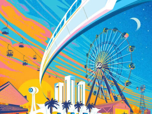
Now to couch it in an inviting setting. Much like with my artwork for the California State Fair’s 50th anniversary, I felt the setting needed to be more of a vibe than a factual schematic. You should feel the amber of the setting sun and the warm Pacific breeeze as it colored the skyline, the sea, the setting. Employing an abstract, if minimal, style would allow a few larger-than-life liberties to be taken that would make the location feel welcoming and inviting.

It was all beginning to come together. We had an iconic illustration for what would be an iconic setting for a fantastic weekend. I wanted that vibe to extend to the motion assets as well. Less of a kinetic assault and more of a pleasant sunbeam to bask in. “Inviting” again would be the watchword here. I wanted it to pleasantly coax you in.
And of course with our footing established and a look in place, we then articulated this out through a number of different assets


Client: Activated Events
Roles: Art Direction, Design, Illustration, Motion
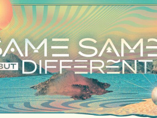
Recent Work