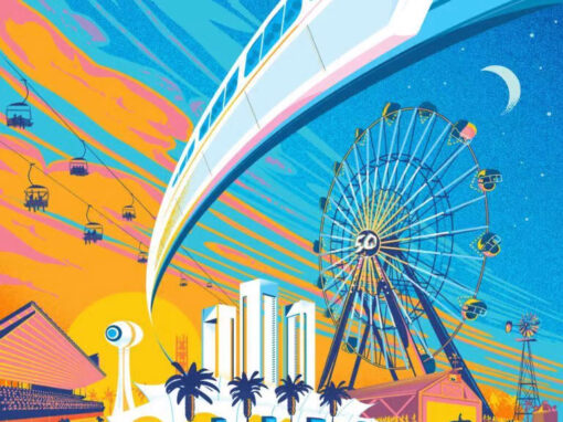
California State Fair 50th Anniversary Poster
California State Fair Poster 2017: The Concept
2017 marked the California State Fair’s 50th year at Sacramento’s Cal Expo fairgrounds since moving there from inside the city proper in 1968. To mark the occasion, my then-fiancé-now-wife (UnCommon‘s Amber Witzke, who has worked as Art Director and designer on CSF branding the past several years) suggested we make a limited edition poster in the style of Disneyland’s classic attraction posters, specifically an homage to their classic and iconic Monorail poster.

Cal Expo has its own monorail (if a bit less sleek and “jet age” as the ones in Anaheim and Orlando) and what’s more its also been the site of Disney’s California Adventure’s transplanted “CALIFORNIA” entrance letters since 2013. We could use these connections to create something really exciting and special as a souvenir to promote the anniversary.

Amber had a rough sketch for how she wanted things to go, and for the most part we would stick to this plan. The most important thing was getting that arc of the monorail track right, which is a trickier hurdle to clear than you might think. The angle needed to be just right to give a sense of sweep and velocity. A few degrees off and the monorail becomes tame and inert. We wanted “woosh.”
I wanted that feeling to come across crystal clear. How would it feel as a perfect day at the fair turns into an electric night?

I wanted this poster to reach out at you and pull you in. Perspective became key. To that end that’s also where I began. The very first thing I did was set a low horizon line and a number of radial perspective lines with a starting arc for the monorail track. While these would shift slightly over the course of putting it all together it was absolutely vital in keeping things in harmony as they were added.

The Process
We wanted the color palette to hew toward the gold and blue of the State Fair ribbon they are using as its logo but we wanted to involve some pinks and possibly purple as well to give it all the feeling of the unique sunsets we enjoy all summer here in Sacramento. Being on the ground at CalExpo gives one the perfect vantage point for those sunsets: long shadows, impossibly bright horizons climbing up to brilliant pink skies. I wanted that feeling to come across crystal clear. How would it feel as a perfect day at the fair turns into an electric night? The colors and perspective would need to carry that weight. The feeling of a “golden hour” blown-out sunset.
One of the other challenges I faced was how to represent multiple facets of the State Fair. It couldn’t just be about the rides as the Fair is more than just a carnival. We’d need to incorporate a diversity of attractions as well as a diversity of people. Of course we would have a towering ferris wheel, but we’d also need landmarks like the famous water tower (here repainted to its initial 60s “mod” paint job), events like horse racing, agricultural exhibits and a petting zoo, the skyway ride ferrying attendees above it all and populating it people of all sizes, ages, shapes, and ethnicities. I even decided to include a wheelchair-bound visitor in the petting zoo to give us a greater spectrum of visibilities throughout. This was a fair for everyone and I wanted that to come across as much as is possible with an illustration rendered in a restricted palette of colors.
The Aesthetic
I wanted this illustration to have the feeling of being organically created in spite of it being produced entirely within illustrator. Where possible I would scan in and employ hand-drawn textures, and I included areas of airbrush-style shading to soften up the over all look. The sunset would create a lot of sharp edges in the lighting but I didn’t want the overall look to be too severe. Stippling the night sky and some of the transitional shadows would help things not look too angular and hard on the eyes. The clouds were the trickiest part and I tried a number of things there. If the clouds were too fluffy and buoyant they tended to step on the perspective. Putting the clouds into the same perspective as everything else just didn’t feel organic. I needed a different option. Eventually I stopped thinking of the clouds as clouds and instead thought about shape. What shape would I want here, and could clouds be made to conform to it? I painted in the most blunt strokes I possibly could, reduced the canvas size onscreen, squinted a bit, and worked the strokes until they had the kind of impact I’d want them to from 100 feet. That ended up being a breakthrough in more ways than one since it also is how I arrived at an overarching theme for the poster…
Conclusion
More than any other poster I’ve designed this is likely the one I will end up proudest of and I’m incredibly grateful that it found its way to me. In all my work I am fascinated with perspective and movement and here I think I have found a way to boldly express both. Moreover I am glad to have been afforded the opportunity to contribute a little something to the history of the state I love and which I’ve called home for nearly 20 years.
Recent Work