Nevada County Transit Rebrand
The Before Times
In January of 2020 (right before…well…you know) we were all still firmly footed in what some call “the before times.” My copywriter and at-the-time conceptual partner Jenna Lazzarone (cracking good copywriter, should you be in the market for one) were working at Sacramento’s 3fold agency, and we had been tasked with a full rebrand Nevada County Transit, a rapid transit system servicing the Northeastern California area including Grass Valley. With our mission in place, we of set off north to the Grass Valley area to research what was working about the brand, what could be improved upon, and how we could find a new way to present Nevada County Transit as a brand.
A Break with the Tropes of the Past
At the time, the transit system up in Nevada County was beholden to some well-worn brand elements devoted to the area’s history as a gold rush boomtown.
Dubbed the Gold Country Stage, it was a sturdy brand that had over time simply not grown alongside the region. It felt more aligned with mid-20th century tourism vibes than the sophisticated and arty town it had since grown in to. Further, the public in the area didnt really have much of a solid perception for what the transit line even was or how it could fit into their lives and lifestyles.
Simplification was Key
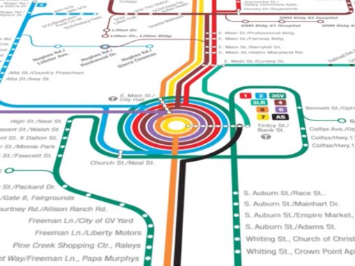
In interviewing locals about the service, one thing came up more often than anything else: its current map was unwieldy and too hard to parse at a glance. In looking at it you could see why. It’s a classic example of a map that’s trying to say too many things, to express every bend in the road, every detail for miles. What if we took the example of large metropolitan subway lines and worked from there? This would also give us a way to streamline not just the logo but the name itself.
Exit Gold Country Stage, Enter: Nevada County Connects.
Making the Brand About Connection, Destination and Lifestyle
I wanted to focus on Nevada County Transit as a consumer brand, since that was the way the public would be interacting with it. What does it feel like? How does it make you feel? What does it do for you? In a city full of brewpubs and art galleries and interesting restaurants, how will it fit in between the rider and those points. The destination point itself would become an important piece of the logo mark, and we would articulate that out through the brand materials, posters, flyers, fare cards, shelters, and even the fleet itself.
What if we took the example of large metropolitan subway lines and worked from there? This would also give us a way to streamline not just the logo but the name itself.
My goal with the “connects” logo was to tap into riders’ sense of adventure. For that reason, the end of the ”S” pushes off infinitely, giving a sense of an open-ended road with limitless possibilities. This is a concept that was articulated throughout print and environmental materials, as well as on the fleet itself.


A sleek “supergraphics” style brand extends to the service map itself
We had our mark and a way to articulate it thoughout the brand system, but we needed to remember that one of the original problems we were hired to solve was the map itself. Fortunately, I had a fantastic designer to turn loose on it. Maria “Masha” Ratinova was my graphic designer at 3fold and being a native of Moscow originally, she knew her way around sprawling transit maps. She would take it on like it was the transit map for a large cosmopolitan metropolis, with all the minimalism and simplification that comes with it. Her system map was truly a thing of beauty.

The system map comes alive
Masha’s terrific work on the map itself cant help but feel like a moving thing, even as a static asset. But she went a step further, tossed it into After Effects and really made it come to life in sprawling motion. We used it on several motion assets across every social channel.
Client: Nevada County Transit
Roles: Art Direction, Design, Motion, Strategy
Recent Work