Slouchers: The Novelization
Before the Flannel
My Slouchers book cover design began with the humor writer and satirist Mike Sacks, whose work has drawn cult-level attention from comedians and performers. In a recent profile, The Hollywood Reporter described Sacks as someone who “never put much stock in trends or traditional definitions of comedy success,” a sentiment that runs through much of his writing. Slouchers spoofs the early 1990s grunge scene, following a cast of post-college misfits who might have stepped straight out of Cameron Crowe’s Singles if that film had been written by the writers of Wet Hot American Summer. The book’s humor is rooted in nostalgia but also pokes fun at how that nostalgia itself was built. I was commissioned to design the new illustrated cover for the book’s second edition, which offered an opportunity to reinterpret the world of Slouchers through a fresh lens.
The Retrospective Filter
When I began the project, I kept thinking about how popular memory has run the early 90s through a Retrospective Filter. Over time the decade has been condensed into a shorthand of flannel, VHS static, and permanent drizzle. Having lived through it, I remembered it looking like that, but feeling slightly different. Less cinematic, more fluorescent. That tension between the cultural myth and the lived texture became the foundation for my design approach.
Early Direction
I first approached the project as a graphic design exercise. I explored typographic and layout-driven ideas that referenced the advertising and print culture of the period. I shared several of these with Mike, who was generous with feedback and open to experimentation.
Concept A
I play off the video connection here and the look (leaning heavy on Template Gothic, the typeface that more or less embodied 92/93) and color palette evokes the 90s as it was finishing its transition from the late 80s (before everything went turgid and earth-toned). I also include a couple story-specific easter eggs in the cassette design.

The first Slouchers cover concept channels 1992 video-store culture through a VHS cassette design, nostalgic color blocking, and Template Gothic typography—an unmistakable callback to early-90s aesthetics and the cultural shift from the 80s to the grunge decade.
Concept B
Here I go a tad more oblique, semi-obscuring the title behind the flannel shirt in an homage to the classic Nirvana tee (with smiley redrawn to convey smug apathy) and the supporting text is set in that grungy typewriter face that was suddenly everywhere from summer 93 on (shoutout to The Posies’ Frosting on the Beater) and I also bring in the nod to the video angle by making the “rewind” sticker a pin.

Concept B leans into grunge culture and 90s iconography. Jason Malmberg references Nirvana’s classic smiley tee, adds a flannel overlay to partially veil the title, and sets the supporting type in a worn typewriter font straight out of 1993. A “Be Kind Rewind” sticker becomes a pin, tying the design back to the video-store motif and the book’s self-aware humor.
Concept C
This is a little bit more abstract a concept but it has a bit of a 90s zine aesthetic and vibe. I use the blank tape sleeves to spell out the tagline in supertext leading to the title itself. I also easter egg in some of the famous made-up grunge slang “grunge speak” on the spines for extra fun.

Concept C takes a typographic approach, building the tagline across a series of VHS spines to evoke the handmade zine culture of the early 90s. Each tape label carries distinct fonts and textures—some nodding to faux “grunge slang” from the era—culminating in the title Slouchers rendered in bold orange for maximum contrast.
Pivot to Illustration
Mike had seen my rock-poster work, which leans more illustrative, and wanted to move in that direction. That shift aligned perfectly with where I was creatively at the time. I had recently started incorporating my iPad Pro into my process and saw this as a chance to test how fully I could build a piece digitally while maintaining the tactile imperfection of analog drawing.


Process and Tools
I had hoped to use Adobe Illustrator for iPad but found its feature set limited. I switched to Affinity Designer, which gave me the vector control I needed to build detailed scenes and maintain the layered precision I wanted. That flexibility proved essential as the composition grew more complex.
The book’s locations, like the “Inconvenience Mart,” and its cast of characters—Willow, Spooner, Vicky, and JackJack—gave me a full world to draw from
Research First. Always research first
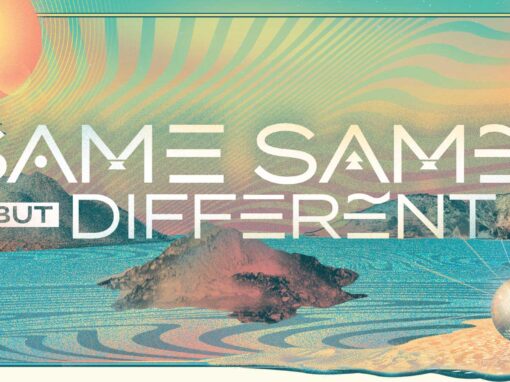
Before beginning, I read the galley in full. That’s part of what I call my “Research First” philosophy: understanding the story’s tone and rhythm before putting pen to tablet. The book’s locations, like the “Inconvenience Mart,” and its cast of characters—Willow, Spooner, Vicky, and JackJack—gave me a full world to draw from. I built a single tableau that wove those personalities together with landmarks like the Space Needle and fictional Seattle storefronts such as Bean There Coffee and Video Plus.

Execution and Outcome
The final illustration works like a wide-angle film still, capturing an imagined 1992 where irony and optimism shared the same parking lot. The scene is crowded, self-aware, and slightly absurd, much like the decade itself. Created for the second edition of Slouchers, this version became both a parody of nostalgia and a celebration of it, a love letter to an era that never quite looked like we remember it.
Client: Mike Sacks
Roles: Art Direction, Illustration
Recent Work