How to Define a Vibe: 7 Years of Concerts in the Park
The Evolution of a Festival Brand Identity: 2018–2024
How do you keep a city’s biggest summer tradition feeling fresh for seven years?
For five seasons of Sacramento’s Concerts in the Park, I wasn’t just designing posters; I was building a visual language for a community. From the first sketch to the final motion graphics, the goal was to ensure every aesthetic choice was rooted in the local culture. We didn’t just want it to look “cool”—it had to feel like Sacramento. Building a festival brand identity is a marathon, not a sprint. Over nearly a decade, the project scaled from a single “limited edition” gig poster into a comprehensive world-building exercise.
2018–2019: The Foundation
When I stepped in, Concerts in the Park was already a twenty-five-year-old institution, but it had recently undergone a significant rebrand. This new visual system introduced Chip the Squirrel and a kit of icons that would serve as the bedrock for the next seven years of work. My challenge was to take these new assets and translate them into a high energy experience that felt less like a city flyer for a local festival with logo and lineup and toward something more experiential, like a touring gig poster.
My challenge was to take these new assets and translate them into a high energy experience that felt less like a city flyer for a local festival with logo and lineup and toward something more experiential, like a touring gig poster.
2018: The Brand (Re)Launch

Pushing the bounds: Taking a new brand system and operationalizing it into a high-energy festival poster that moved beyond the traditional event flyer.
For my first poster of this era, I looked to Frank Olinsky’s iconic album art for The Power Station’s self-titled 1985 debut. That record provided the blueprint for taking a set of polite line drawings and pushing them into more energetic and contorted dynamic illustrations to convey action and excitement. By distorting the foundational brand icons, I was able to transform a static system into a living campaign. In addition to the poster, this would also include…
The 2018 Motion Poster
To support the launch, I developed a matching motion graphic of the poster featuring a punk rock version of Chip playing a Flying V guitar. This ensured the brand felt as loud as the music and would hit the most common touchpoint for music event promotion these days, the social feed. And it being a video, every second watched fed into the algo and further boosted engagement.
The AR Reveal: Using People's Devices to Build-Up the Lineup Annnouncement
The launch culminated in an Augmented Reality experience at the April 2018 lineup announcement event. The team at Sol Collective in Sacramento rigged the motion poster to map directly to physical flyers handed out in César Chávez Plaza, allowing fans to see the artwork come to life through their phones.
2019: Moving Forward Through Rewinding
For the second season of my tenure, the goal was to deepen the collectible nature of the series by leaning into a tactile, retro-tech aesthetic. We moved away from the raw, contorted energy of the previous year and toward a highly structured, cassette-inspired visual language. This allowed us to treat the entire festival lineup as a literal mix tape for the city.

Fleshing out a brand icon: Using the 2018 kit as the seed for a massive, analog-inspired centerpiece.
-
The Boombox Motif: My inspiration for this season came directly from a single boombox icon within the recent rebrand kit. I saw the potential to flesh out that small asset into a massive, detailed illustration that could anchor the entire campaign. By scaling that icon up and turning it into a complex framing device for the artist names, I shifted the project further into the realm of limited edition gig posters.
-
The Cassette Reveal: To reveal the lineup, I developed a motion graphic that mimicked the mechanical action of a cassette tape being inserted and played. This was a functional piece of music industry branding that gave the digital audience a sensory connection to the physical art.
-
System Expansion: This year proved that the foundational brand icons could be repurposed into entirely different thematic worlds, in this case, transforming the 2018 kit into mechanical components of a vintage sound system.
The Motion Poster
With the rebrand established, the 2019 campaign focused on world-building. I wanted to move beyond static presentation and create a narrative environment for Chip to inhabit. In the extended motion reveal, we see him speeding through Sacramento on a summer day, navigating the city on a scooter with a popsicle in hand.
The 2019 Extended Cut
To maintain a high-energy flow, I used the geometric DNA of the new brand system as a functional tool. By identifying common shapes shared between the various icons, I created fluid, “invisible” transitions to move from scene to scene. This approach turned the icon kit into a cohesive visual language rather than just a collection of symbols, allowing the brand to feel like a living, breathing part of the Sacramento summer experience.
In February (2020), I was sitting in the Denver International Airport working on the upcoming season’s art on my iPad; no lineup had been secured yet, but the visual foundation was already taking shape. A month later, the pandemic hit.
2020 and 2021: The Lost Seasons
The momentum of the previous two years hit a literal standstill in early 2020. In February, I was sitting in the Denver International Airport working on the upcoming season’s art on my iPad; no lineup had been secured yet, but the visual foundation was already taking shape. A month later, the pandemic hit. We spent weeks moving dates back in increments, holding onto the hope of a late-summer start, before finally admitting that there would be no CIP in 2020. That hiatus ultimately stretched through 2021, leaving the brand in a state of silence until the park was ready for the music to start again in 2022.
2022: The Triumphant Return
When we finally returned in 2022, the long absence provided a unique opportunity to shake up the design language. While we used elements from the previous seasons as a jumping-off point, we weren’t interested in just picking up where we left off. Instead, we used the comeback as an excuse to add more colors and richer textures to the paintbox. This allowed the brand to feel familiar to long-time fans but with a noticeably higher production value and a more layered, sophisticated aesthetic that signaled a new chapter for the festival.
-
The Expanded Palette: We moved beyond the tighter color constraints of the foundational years, introducing more vibrant hits and textured overlays that gave the posters a physical, “screen-printed” grit.
-
Atmospheric Assets: To signal that the festival was back in a big way, I developed secondary motion pieces like the branded blimp. This wasn’t just about listing a lineup; it was about creating a sense of spectacle that made the festival feel like a major civic event returning to the skyline.
-
Evolving the Icons: The brand system remained the core, but it was now treated with more depth. We transitioned from the clean, flat illustrations of 2018 into a more maximalist space that mirrored the excitement of the city’s reopening.

The Return: Thickening the visual language with a more complex color palette and tactile grit.
The CIP 2022 Motion Poster
- The Final Reveal: The 30-second lineup reveal synthesized these new elements into a high-energy digital launch. By combining the blimp animation with the textured, maximalist aesthetic of the poster, we created a punchy, unmistakable signal that the festival was back and better than ever.
2023: Character(s) & Scale
Building on the expanded paintbox of the previous year, 2023 was about personifying the music. I took the foundational squirrel and chipmunk icons and developed them into a cast of genre-specific performers—a pop diva, an indie synth player, a country-rocker, and a DJ. This allowed the campaign to speak directly to the different musical tribes that attend the festival while keeping the mascot at the heart of the story.
-
Personified Branding: By giving the icons instruments and distinct personalities, we moved from abstract symbols to character-driven storytelling. This made the 2023 art feel like a celebration of the performers themselves.
-
The Physical Reveal: For the first time, we shifted away from a digital motion reveal in favor of a physical reveal. I designed a 20-foot fabric banner that was unveiled at a live event in the city. Seeing the brand system scaled to this size—printed on a tactile medium—reinforced the deep texture and collectible, “gig-poster” aesthetic we had been cultivating for years.
-
Genre-Driven Design: Each character was styled to match the energy of the lineup, ensuring that whether someone was there for indie-rock or electronic sets, they saw themselves reflected in the festival’s visual identity.

Personifying the sound: Transforming brand icons into a cast of musical characters.
The 2023 Reveal: Scaling to the Streets
In 2023, we moved away from a digital-only reveal strategy to create a high-impact physical moment for the city. I designed a massive 20-foot fabric banner featuring the full lineup and the “performer” characters, which was unveiled during a live event in downtown Sacramento in front of Solomon’s.
-
Physical Presence: Seeing the digital brand system scaled to 20 feet of textured fabric reinforced the “collectible” nature of the art. It turned the lineup announcement into a civic milestone that people could experience in person.
-
Tactile Impact: The move to fabric—rather than a digital screen or a standard vinyl banner—gave the brand a weight and permanence that matched its role as a Sacramento institution.
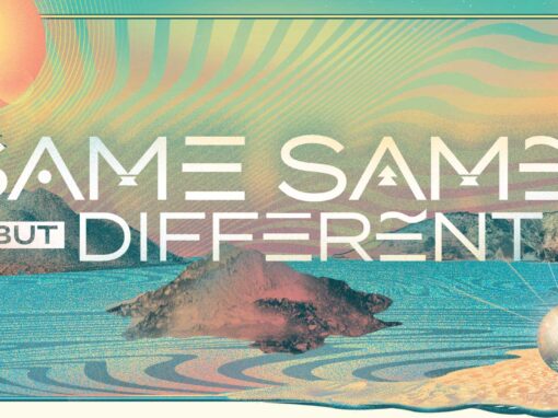
2024: A Cosmic Convergence
By 2024, the “paintbox” was fully unrestricted. The design strategy shifted toward a maximalist, sci-fi aesthetic that integrated the city’s skyline with extraterrestrial elements. The central icon evolved from the 2022 blimp into a massive UFO, beaming the music directly into Cesar Chavez Plaza.
-
Hyper-Local Synergy: The beam emitted from the mothership and the skyline is a direct nod to the Sacramento Kings’ “Light the Beam” victory tradition. By merging the UFO’s tractor beam with this iconic civic symbol, the artwork creates an immediate emotional connection with the city’s sports culture and collective pride.
-
Departure from the Mascot: This iteration marked a significant shift by leaving behind the mascot-focused theme of previous years. Rather than centering the art on a single character, the 2024 design prioritized the scale and energy of the environment itself.
-
Easter Egg Rewards: While the mascot was no longer the lead, a fan in a “Chip” costume can be seen crowd-surfing in one of the vignettes. This serves as a nod to the brand’s history while documenting the actual culture of the festival.
-
Showcasing Amenities: Surrounding the main lineup beam are detailed vignettes that highlight the festival’s diverse offerings—from DJs and live painting to the food and beverage experience—all unified by a neon-soaked, retro-futuristic texture.
-
Intergalactic Sacramento: Local landmarks like the Tower Bridge and downtown high-rises were reimagined under a cosmic purple and teal sky, signaling that the festival had grown into a larger-than-life phenomenon.

Out of this world: Bridging the "Victory Beam" with Sacramento’s biggest summer stage.
The Visual Legacy: Beyond the Park
Looking back at the trajectory from 2018 to 2024, the evolution of Concerts in the Park represents a case study in brand endurance. What began as a mission to create a recognizable mascot and a clean identity eventually transformed into a sprawling, multi-dimensional universe. By consistently “thickening” the paintbox and introducing new textures each year, the brand managed to stay ahead of the curve, shifting from ground-level character work to a high-concept, sci-fi spectacle that occupied the entire Sacramento skyline.
-
Strategic Evolution: We successfully transitioned from a mascot-centric approach to a world-building narrative, proving that a brand can grow alongside its audience without losing its core identity.
-
Tactile and Digital Synergy: By balancing high-energy motion reveals with massive physical installations—like the 20-foot fabric banner—the campaign bridged the gap between the digital scroll and the physical experience of the city.
-
Cultural Impact: Over seven years, these posters moved beyond mere advertisements to become collectible artifacts of Sacramento’s cultural history. The journey from a lone squirrel in 2018 to a “Mother Ship” arrival in 2024 mirrors the growth of the festival itself: bolder, more inclusive, and undeniably iconic.
The result is a brand that doesn’t just announce a lineup; it creates an atmosphere. It’s a reminder that even for a free community event, the investment in high-level art direction and narrative-driven design pays off in long-term brand equity and civic pride.
Client: Downtown Sacramento Partnership | Concerts in the Park
Roles: Art Direction, Design, Illustration, Motion
Recent Work