KLJ ADHD AF: Visualizing the Invisible
How do you illustrate a brain that never stops?
The Hook
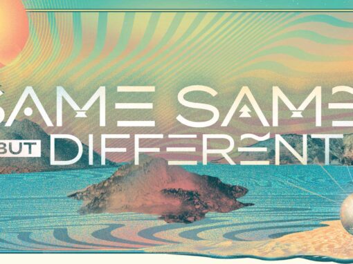
How does one illustrate a brain that never stops? How indeed. This kinetic branding campaign for comedian Keith Lowell Jensen is a visceral deconstruction of the neurodivergent experience. Long before my own ADHD diagnosis, I used this project to subconsciously map the “antsy” energy and shifting focus of a mind in constant motion. The result was a successful multi-platform tour identity and a selection for the World Illustration Awards Longlist.
The Context
Northern California comedian Keith Lowell Jensen approached me for a tour of new material titled KLJ ADHD AF. The show centered on how ADHD informed and defined his comedy. Keith was laudably hands-off, offering only one specific request: a visual reference to Ritalin within the composition (which I did in a subtle way. Look for the molecular composition in the shattered glass of his eyeglasses.)

The Creative Solution: Subconscious Interpretation
At the time, I was undiagnosed but felt a profound “special lens” into this world. I wanted to move beyond literal representation and instead convey the feeling of a flurry of interrupting tangents layered endlessly and pushing in every direction.
- The Metaphor: I illustrated Keith’s head unravelling and springing forth from a pill capsule, visually representing a mind that refuses to be contained.
- The Palette: I chose colors specifically to express an “antsy,” high-frequency energy.
- The Admat: Since the tour required flexibility, my tour poster design doubled as a pharmaceutical label “admat” (an advertising material template) with designated space for varying dates and venues.
Motion Branding & Client Empowerment
Since motion is now an integral part of the cultural landscape, particularly in the social media sphere where so much of promotion happens these days, I deconstructed the static illustration into a suite of high-impact motion assets. These were optimized for both Feed and Story placements to ensure the “KLJ ADHD AF” brand felt cohesive across every social touchpoint.
The “Hey Keith!” Pattern Interrupt (Sound Up)
The foundational centerpiece of the motion campaign is the “Hey Keith!” asset (named to get his attention for approval of concept before moving into the remaining assets). Following my production checklist, this video leads with a visual and auditory mystery, the rattling of a pill bottle, to stop the scroll within two seconds. The transition from the clinical pharmaceutical label to the “explosion” of the award-winning art mimics the energy of the show itself.
Workflow Efficiency & Scalability
To ensure the tour remained agile, I provided Jensen with the tools to manage his own logistics.
- Canva Integration: I imported the pharmaceutical “admat” templates into Canva, allowing the client to update venue and date details at his own discretion.
- Professional Standards: This is a high-efficiency workflow I frequently employ when designing for major music festivals to ensure brand consistency without bottlenecks.
- Platform Versatility: Assets were rendered in native 1080×1920 (Story) and 1080×1350 (Feed) sizes to optimize for platform-specific AI categorization.
Outcome: Validation Through Meaning
The final campaign for KLJ ADHD AF serves as a definitive case study in my “Meaning Over Ornament” philosophy: the belief that every aesthetic choice must be anchored in a functional, communicative truth. By prioritizing the “why” of the neurodivergent experience over mere visual flair, the work achieved both commercial utility for the tour and international critical acclaim.
- International Recognition: The core illustration was honored with a selection for the World Illustration Awards Longlist in the Advertising category, validating the technical and conceptual depth of the project on a global stage.
- Commercial Success: The kinetic branding system provided Keith Lowell Jensen with a flexible, high-impact toolkit that stopped the scroll and successfully drove engagement for his tour.
- Lasting Impact: This project remains a personal benchmark for how design can translate complex, invisible internal states into a shared visual language.
Client: Keith Lowell Jensen
Roles: Art Direction, Illustration, Motion
Recent Work