SDIC: 10 Colleges. One Identity.
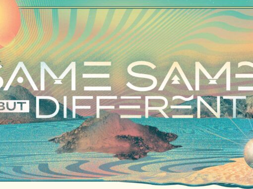
Unifying 10 Colleges Under One Narrative: The "Community Crafted" Campaign.
The Challenge: Regional Diplomacy
The San Diego and Imperial County Regional College Consortium is a massive educational network of 10 distinct institutions. The geographic footprint is staggering, stretching from urban Chula Vista near the US/Mexico border to the rural expanses of Imperial County over 100 miles away.
The primary challenge wasn’t just aesthetic—it was diplomatic. These 10 colleges, while sharing a regional mission, often operate as fierce competitors for enrollment and resources. My role was to navigate these entrenched institutional identities and find the “connective tissue” that could bind them together.
Beyond the politics, we had to combat a persistent stigma: the perception that community college is merely a “stepping stone” to universities like San Diego State University. We needed a brand that elevated these colleges as final destinations for specialized, high-value career training.
The Strategy: Breaking the Collegiate Cliché
We made a conscious decision to avoid the “standard” higher education playbook—no smiling students in backpacks, donning graduation caps with boilerplate platitudes about “Finding Your Future”.
-
The Iterative Search: The final brand was the result of exhaustive brainstorming, including dozens of pages of naming directions.
-
The Discovery: The breakthrough came when I saw “Community” and “Crafted” on separate suggestion pages. Merging them felt immediate, distinct, and authoritative.
-
The “Umbrella” Framework: We developed a system that was intentionally extensible. This allowed us to speak to the individual strengths of each campus and their specific Career Education programs, from culinary arts to firefighter training, while keeping every asset under one regional banner
...we had to combat a persistent stigma: the perception that community college is merely a "stepping stone" to universities like San Diego State University.
Inclusive Strategy: “Transcreation” over Translation
With a significant population of first- and second-generation Hispanic students across the 100-mile border region, the campaign had to speak to the majority stakeholder natively.
Defining the Approach
In branding, Transcreation is the process of adapting a message from one language to another while maintaining its intent, style, tone, and context. While a literal translation of “Community Crafted” might have felt clunky or academic, we developed Diseñado para la Comunidad (“Designed for the Community”) to capture the same sense of intentionality and regional pride.
-
Cultural Competence: This wasn’t just a language swap; it was a shift to ensure the “merch-ready” prestige of the brand resonated with Spanish-speaking families.
-
Visual Synergy: The Spanish mark maintains the same tactile, dimensional typography as the English original, ensuring a seamless brand experience across the entire consortium.
Cinematic Strategy: Capturing the Student Experience
A Cross-Regional Production
To truly represent the San Diego and Imperial County Regional College Consortium, we spent a week on the ground, deploying two film crews to criss-cross the Southern Border Region. We captured the unique energy of all 10 campuses, from the urban corridors of San Diego to the vast landscapes of Imperial County, focusing on the consortium’s diverse array of Career Education programs.
The Corner Booth Partnership
This project marked another successful collaboration with Frank Swoboda and his videography teams from Spokane’s Corner Booth Media. Having partnered with Frank on numerous shoots, we’ve developed a shorthand that allows us to manage complex regional logistics without sacrificing the “cinematic” requirement I demand for every asset.
The “In-The-Moment” Philosophy
My goal was to move beyond the static, posed imagery common in higher education and instead create a visceral, first-person perspective:
-
Authenticity over Artifice: We largely avoided posed shots, opting for a “hands-on” approach that captured students in the middle of the action.
-
Collaborative Context: Rather than isolated students posing with equipment, we showcased them utilizing the tools of their trade in teams, highlighting the genuine camaraderie found in these programs.
-
Igniting Imagination: By documenting authentic moments—from audio engineering to firefighter training—we aimed to spark the imaginations of potential students, allowing them to visualize exactly what their lives could become if they enrolled.
The Campaign Anthem
“The 30-second anthem was the culmination of our cross-regional production. It serves as the brand’s ‘Source of Truth,’ weaving together the stories of students across 10 campuses. By focusing on the tangible, collaborative nature of Career Education—and avoiding the usual collegiate tropes—we created a piece that feels both aspirational and authentically grounded in the communities it serves.”
Multi-Channel Articulation: Designed for Engagement
Beyond the 30-Second Spot
To truly permeate the region, the “Community Crafted” identity had to move beyond traditional television and thrive in high-engagement social environments. We developed a series of short-form, platform-specific assets for TikTok, Instagram, and Facebook—each designed to capture the specific energy of a program in just a few seconds.
Capturing the “Vibe”
These aren’t just ads; they are visual explorations designed to provoke a feeling of immediate possibility.
-
Platform-Native Storytelling: We optimized each asset for vertical viewing, ensuring the “Community Crafted” and “Diseñado para la Comunidad” marks felt like a natural part of the student’s daily feed.
-
High-Impact Career Ed: We showcased the diversity of the consortium’s offerings—from the technical precision of Audio Production to the high-stakes environment of Firefighter Training and the artistry of Cosmetology.
-
Bilingual Consistency: By maintaining the same high production value and “Transcreation” strategy across all social channels, we ensured a unified brand experience for both English and Spanish-speaking audiences.
The Result: Scale Without Friction
The project wasn’t just a visual overhaul; it was a strategic realignment. By moving away from generic imagery and toward share-driven value, we achieved a documented increase in student enrollment and successfully bridged the “confidence gap” for parents and caretakers across the region.
The ultimate success of Community Crafted lay in its radical simplicity. This aesthetic flexibility allowed the campaign to move seamlessly from granular TikTok series to massive experiential activations, including a skywriter over San Diego Fleet Week. The theme was robust enough to maintain its integrity whether viewed on a five-inch screen or written across the California sky, proving that when the meaning is strong, the ornament becomes unnecessary.
Client: San Diego and Imperial County Regional College Consortium
Roles: Art Direction, Design, Motion, Strategy
Agency: 3fold
Recent Work