Los Rios Community College District — Evolving an Educational Brand with Heart
A multi-year collaboration that reimagined how a California college district connects with its community — through design, copy, and storytelling that feel real, relatable, and distinctly human.
Over several years working with the Los Rios Community College District, I helped evolve how the district expressed itself both visually and verbally. My work spanned logo and identity systems, headlines and copy for enrollment campaigns, social content, and digital storytelling. Beyond design, I wrote some of Los Rios’s most resonant headlines—many still in use today—and campaign copy that spoke directly to students’ aspirations without leaning on familiar clichés found in higher-ed marketing.
Note
In higher-ed marketing, strategic craft and emotional storytelling are often reserved for four-year universities. I wanted to challenge that idea. Community-college campaigns are frequently treated as serviceable and safe, yet the students, educators, and staff within these institutions deserve more. My work with Los Rios set out to prove that community-college branding can carry the same thought, creativity, and emotional depth as any national campaign. The stories behind it are every bit as powerful.
When I began working with Los Rios, the goal was not to reinvent its identity but to build on what already worked—to refresh key visual elements and campaign materials so that the district’s presence felt as forward-looking as the work it was doing across its campuses.
An early iteration of the Los Rios Community College District Logo. Image artificating is the result of available source.
A Modernized Mark for a Modern Mission
Redesigning the Los Rios Community College District logo was a small task with a large shadow. The mark would become the flag uniting all five colleges, and that responsibility carried weight. My team was eager to take it on.
We began with a careful audit of the existing visual system. The original mark carried history and recognition. However, it struggled to adapt across digital and campaign contexts. The updated design preserved its core composition while introducing refined proportions, cleaner geometry, and motion-ready simplicity.
The river motif, long part of Los Rios’s DNA, was reimagined through sleek supergraphics that gave the mark a modern footing and timeless resonance. It reflects the waterways that connect the district’s colleges and communities, symbolizing flow, unity, and progress. The result is a renewed emblem, timeless in spirit and optimized for a contemporary, multi-channel world.
Designer: Christina Perhac | Creative Director: Jason Malmberg
A Unified System Identity
Because the new mark would represent the full district, we developed a lockup accommodating all four college logos—American River, Cosumnes River, Folsom Lake, and Sacramento City Colleges. Together they form a cohesive, modernized identity system.
Introducing the New Look
To launch the update, I edited existing B-roll footage from all campuses and produced a short reveal video using the wave motif as a visual throughline. This video introduced the refreshed look to the district and to the broader community.
Reimagining a 55-Year Identity for Cosumnes River College
Cosumnes River College presented a different design challenge. We needed to celebrate a half-century of community pride while creating a mark that could stand confidently within the refreshed Los Rios system. The college’s name evokes a vivid sense of place—the river, the wetlands, and the raptors overhead—and that geography became the foundation for the redesign.
In the new shield, the winding riverbed subtly forms a “C.” This gesture is both literal and symbolic, a curve that represents identity, continuity, and growth. The composition captures Cosumnes River College as an ecosystem: natural, adaptive, and deeply rooted in its community.
Building a Cohesive Visual System
In the new shield, the winding riverbed subtly forms a “C,” both literal and symbolic — a gesture of identity, continuity, and growth. The composition captures Cosumnes River College as an ecosystem: natural, adaptive, and deeply rooted in its community.
The resulting mark feels timeless yet forward-facing, a landscape distilled to its essence.
Design Notes
- Form: The shield reinforces academic legacy while creating a distinctive presence within the Los Rios family.
- Symbolism: The riverbed’s curve forms a subtle “C,” complemented by cattails and a hawk representing the Cosumnes River Basin’s wetlands and wildlife.
- Palette: Built from the Los Rios core palette, pairing deep navy with a vibrant orange for visibility and balance.
- Typography: Uses the humanist sans-serif system (Brandon Grotesque) introduced district-wide for accessibility and cohesion.
- Usage: Designed for clarity across mediums, from embroidered patches to campus signage, ensuring every application feels considered and consistent.
Constructing Copy to Accommodate Languages — Or, How to “Be Both” (The Idiom Dilemma)
In marketing, the idiom of language can trip you up, but the idiom of culture can save you. Everyone remembers the Wayne’s World (1992) scene where Wayne and Garth ask, “Pardon me, do you have any Grey Poupon?” It was a perfect joke for U.S. audiences who knew the famous mustard ads. However, when the film went international, that reference didn’t land. The European dub replaced the mustard with a Fiat Uno reference, instantly local and instantly funny.
That’s The Idiom Dilemma: when words don’t translate, meaning has to.
I kept that principle in mind while developing Los Rios’s enrollment campaigns. Our messaging needed to resonate across multiple languages and lived experiences. The result was the Be Both and Be All Three campaigns, lines designed for adaptation and inclusion.
With Los Rios, higher education wasn’t about fitting one mold. Instead, it was about embracing all the identities that make each student’s story unique. The campaigns extended across digital, print, and the region’s public-transit network, meeting students wherever they were.


We were also able to articulate the message across the Region’s susbstantial fleet of public transit options.


Beyond the Cap and Gown: Creating “Meet Future You”
Soon after Be Both and Be All Three, Los Rios asked for a new campaign that could drive enrollment while also spotlighting its Career Education programs. The goal was to reach potential students who were still finding their path and might not yet realize how many opportunities awaited them through Los Rios.
From the outset, I wanted to avoid the visual clichés of higher-ed marketing. The caps and gowns, the posed smiles, and the high-fives on graduation day had become visual white noise. Meet Future You was created to break that pattern.
The campaign focuses on real-life, in-between moments—when you catch your reflection in a window or your phone and imagine who you might become. It’s about potential, possibility, and taking the first small step toward who you want to be.
In higher-ed marketing, strategic craft and emotional storytelling are often reserved for four-year universities. I wanted to challenge that idea.
Collaborating for Authentic Storytelling
For production, I partnered with Spokane-based Cornerbooth Media, whose naturalistic storytelling style perfectly fit the tone. Together, we created a spot that meets people where they are — on an ordinary day — and invites them to imagine the extraordinary.
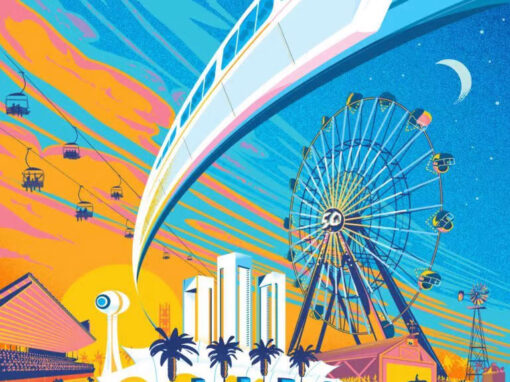
From Campaigns to Constellations: A Brand That Took to the Sky
After years redefining how Los Rios connected with its students, the district wanted to celebrate how far its brand had come. The spark for what became the region’s first higher-education drone show came from our media lead, Christie Pierce. His idea to take the brand into the sky captured everyone’s imagination.
From there, my team designed the show itself. The event illuminated the Sacramento night immediately following a Sac Republic FC match. Hundreds of synchronized drones formed the Los Rios logo and animated imagery from our campaigns. The display transformed the skyline into a living symbol of connection, education, and possibility.
It was the perfect culmination of years of creative groundwork. The collaboration shone as a true constellation in the sky—a moment where Los Rios’s story, once told through campaigns on screens and campuses, finally found its light above them.
Client: Los Rios Community College District
Video Production (“Meet Future You”) : Cornerbooth Media
Roles: Art Direction, Design, Copywriting, Direction, Motion
Agency: 3fold
Recent Work