Coastal Country Jam
The industry comes roaring back
In the winter of 2019/20, I was deep into art for several music festivals, work that typically happens many months ahead of the season, since festival dates ripple out and shape artists’ touring plans for years at a time. Then, of course, everything changed. Spring dates shifted optimistically to early summer, then late summer, then autumn, before being shelved entirely, a pattern that repeated for a year or two straight. Since COVID first hit in 2020, there had been multiple false starts and plans that never made it past the initial sketch stage. By 2023, things finally felt like they were getting back to normal. That year alone, I’d end up designing for four different music festivals in the first four months.
One of those was Coastal Country Jam festival branding, and I was thrilled when Activated Events asked me to help rebrand their long-running festival for its 2023 return, this time in a very different location than its original home in Huntington Beach. The festival was moving north, to Long Beach. And that change of venue was going to shape the artwork from the ground up.
Avoiding the usual “country/western” tropes
Sure, this was a country music festival, but it was also a California country music festival, on the beach, no less. The visual language needed to steer clear of the usual country trappings: no boots, no barn wood, none of that. It needed to at least nod toward the California model of country music, a bit more Eagles than Charlie Daniels Band. I started with a few different brand mark directions to explore that specific vibe, and as I often do, I began with color. What could bridge sand, sea, earth tones, and honky-tonk energy all at once? I put together a simple palette as my jumping-off point.
Color and type are usually my way “in” on a project. Each carries its own language and tone, and together they help light the path toward everything else. Next, I went looking for type that could live in that space between country tradition and California attitude, and mocked up a couple of basic logotype directions.


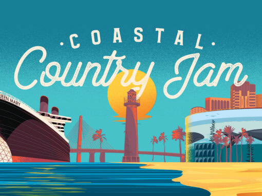
The further we got into the process, the clearer it became that the new location wasn’t just a detail, it was a headliner in its own right. In a third logo direction, I started working in notable Long Beach landmarks: the Queen Mary, the Lions Lighthouse, the Gerald Desmond Bridge. All local landmarks that would feature in the eventual art, poster, and social assets were beginning to work their way in here. I even rough mocked up a version that leaned perhaps too heavily on SoCal beach vibes.
These local icons, which would eventually anchor the poster and social assets, began finding their way into the identity here. I even roughed out a version that leaned a little too hard into SoCal beach vibes, purely for fun.
Color and type are often my way “in” on a project. Each carries its own language and tone into things that help light the path toward what the other elements will be

Personally, I was fond of that direction, but it was clear the Long Beach relocation needed to be more overtly expressed in the design. The new site was only about 15 miles north of Huntington Beach, but those were LA freeway miles, and that distinction might need to become part of the pitch to returning festivalgoers. Visually, the skyline would be the star, since the festival would now take place along Long Beach’s scenic harbor shoreline, at their recently revamped convention center. With that settled, I reworked the concept to put Long Beach front and center, while still wanting the piece to feel different from a tourism photo, something with fun, buoyancy, and simplicity built into the illustration style itself. But first, the logotype needed to lock in. I landed on a mix of vibes, part Pacific waterfront, part country, so the two halves would complement rather than compete. And at last, we had our mark.

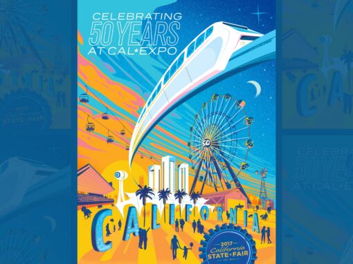
Now to couch it in an inviting setting. Much like with my artwork for the California State Fair’s 50th anniversary, I felt the setting needed to be more of a vibe than a literal, factual schematic. You should feel the amber of the setting sun and the warm Pacific breeze coloring the skyline, the sea, the whole scene. An abstract, minimal illustration style let me take a few larger-than-life liberties that made the location feel welcoming and alive.

It was all coming together: an iconic illustration for what would be an iconic setting, for a weekend that promised to deliver. I wanted that same feeling to carry through into the motion assets too, less of a kinetic assault, more of a pleasant sunbeam to bask in. “Inviting” was the watchword there as well. I wanted it to gently coax you in.
And of course with our footing established and a look in place, we then articulated this out through a number of different assets


Client: Activated Events
Roles: Art Direction, Design, Illustration, Motion
Recent Work